
Clustering Analysis
Published: September 09, 2020Introduction
Clustering is an unsupervised learning problem , its aim is to identify or discover interesting patterns from the data.
This aim of this tutorial is to apply K-means algorithm on numerical data , K-Prototypes algorithm on mixed data (numerical + categorical data) and analyze the properties of resulting clusters to gain insights
- Part 1 : K-means clustering for numerical data.
- Part 2 : K-Prototypes clustering on mixed data.
Background
Data Source : Kaggle Dataset
Context You are owing a supermarket mall and through membership cards , you have some basic data about your customers like Customer ID, age, gender, annual income and spending score. Spending Score is something you assign to the customer based on your defined parameters like customer behavior and purchasing data.
Problem Statement You own the mall and want to understand the customers like who can be easily converge [Target Customers] so that the sense can be given to marketing team and plan the strategy accordingly.
- How to achieve customer segmentation using machine learning algorithm.
- Who are your target customers with whom you can start marketing strategy [easy to converse]
- How the marketing strategy works in real world.
import numpy as np
import pandas as pd
import seaborn as sns
import matplotlib.pyplot as plt
from sklearn.preprocessing import StandardScaler, normalize,MinMaxScaler
from sklearn.cluster import KMeans
from kmodes.kprototypes import KPrototypes
import warnings
warnings.filterwarnings("ignore")
%matplotlib inline
df=pd.read_csv('Mall_Customers.csv')
df.shape
(200, 5)
df.head()
| CustomerID | Gender | Age | Annual Income (k$) | Spending Score (1-100) | |
|---|---|---|---|---|---|
| 0 | 1 | Male | 19 | 15 | 39 |
| 1 | 2 | Male | 21 | 15 | 81 |
| 2 | 3 | Female | 20 | 16 | 6 |
| 3 | 4 | Female | 23 | 16 | 77 |
| 4 | 5 | Female | 31 | 17 | 40 |
df.dtypes
CustomerID                 int64
Gender                    object
Age                        int64
Annual Income (k$)         int64
Spending Score (1-100)     int64
dtype: object
Missing values
missing_cols=df.isnull().sum()/df.shape[0]
missing_cols=missing_cols[missing_cols>0]
missing_cols
Series([], dtype: float64)
No missing values , one less thing to worry about :)
df.set_index('CustomerID',inplace=True)
CustomerID will not be input to the clustering algorithm as it doesn’t have information so converting it to dataframe index
df.head()
| Gender | Age | Annual Income (k$) | Spending Score (1-100) | |
|---|---|---|---|---|
| CustomerID | ||||
| 1 | Male | 19 | 15 | 39 |
| 2 | Male | 21 | 15 | 81 |
| 3 | Female | 20 | 16 | 6 |
| 4 | Female | 23 | 16 | 77 |
| 5 | Female | 31 | 17 | 40 |
num_cols=df.select_dtypes(include=['int64']).columns
ctg_cols=df.select_dtypes(include=['object']).columns

print('Numerical Cols=',num_cols)
print('Categorical Cols=',ctg_cols)
Numerical Cols= Index(['Age', 'Annual Income (k$)', 'Spending Score (1-100)'], dtype='object')
Categorical Cols= Index(['Gender'], dtype='object')
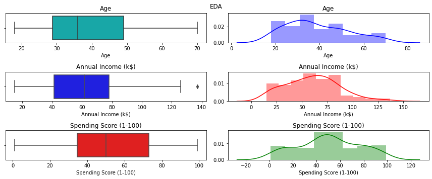
Explooratory Data Analysis (EDA)
cols_val=2
fig, ax = plt.subplots(len(num_cols),cols_val,figsize=(12, 5))
colours_val=['c','b','r','g','y','p','m']
did_not_ran=True
for i,col in enumerate(num_cols):
    for j in range(cols_val):
        if did_not_ran==True:
            sns.boxplot(df[col],ax=ax[i,j],color=colours_val[i+j])
            ax[i,j].set_title(col)
            did_not_ran=False
        else:
            sns.distplot(df[col],ax=ax[i,j],color=colours_val[i+j])
            ax[i,j].set_title(col)
            did_not_ran=True


plt.suptitle("EDA")
plt.tight_layout()
plt.show()
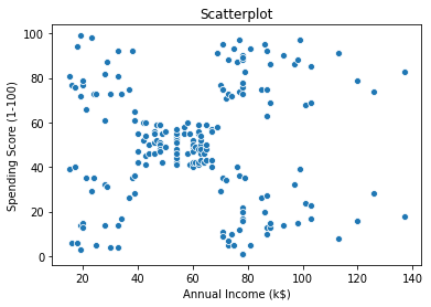
sns.scatterplot(df['Annual Income (k$)'] ,df['Spending Score (1-100)'])
plt.title('Scatterplot')
plt.show()
Converting Age to bins
df.Age.min(),df.Age.max(),
(18, 70)
df['Age_bins']=pd.cut(df.Age,bins=(17,35,50,70),labels=["18-35","36-50","50+"])
df[['Age','Age_bins']].drop_duplicates(subset=['Age_bins']).reset_index(drop=True)
| Age | Age_bins | |
|---|---|---|
| 0 | 19 | 18-35 |
| 1 | 64 | 50+ |
| 2 | 37 | 36-50 |
For initial run , considering Only Annual Income & SpendingScore (numerical data) for the K-means algorithm
df.columns
Index(['Gender', 'Age', 'Annual Income (k$)', 'Spending Score (1-100)',
       'Age_bins'],
      dtype='object')
df1=df[['Annual Income (k$)', 'Spending Score (1-100)']]
df1.shape
(200, 2)
Standardize data to bring them in same scale since Annual income & Spending Score are on different scale
std=MinMaxScaler()
arr1=std.fit_transform(df1)
K-means Algorithm (Number of Cluster = 2)
Starting with K-means algorithm with only 2 clusters
- Parameters
- n_clusters : Number of clusters
- random_state : for reproducibility
%%time
kmeans_cluster=KMeans(n_clusters=2,random_state=7)
result_cluster=kmeans_cluster.fit_predict(arr1)
Wall time: 52 ms
result_cluster[:3]
array([1, 0, 1])
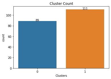
Cluster Analysis
df1['Clusters']=result_cluster
df1['Clusters'].value_counts()
1    111
0     89
Name: Clusters, dtype: int64
ax=sns.countplot(x=df1.Clusters)
for index, row in pd.DataFrame(df1['Clusters'].value_counts()).iterrows():
    ax.text(index,row.values[0], str(round(row.values[0])),color='black', ha="center")
    #print(index,row.values[0])
plt.title('Cluster Count')
plt.show()
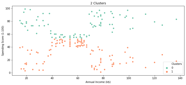
plt.figure(figsize=(12,5))
sns.scatterplot(x=df1['Annual Income (k$)'],y=df1['Spending Score (1-100)'],hue=df1.Clusters,palette="Set2",)
plt.title('2 Clusters')
plt.show()
fig,ax=plt.subplots(1,2,figsize=(12,5))
sns.heatmap(df1.loc[df1.Clusters==0,['Annual Income (k$)', 'Spending Score (1-100)']].describe().round(),annot=True,fmt='g',ax=ax[0])
ax[0].set_title("Cluster-0")
sns.heatmap(df1.loc[df1.Clusters==1,['Annual Income (k$)', 'Spending Score (1-100)']].describe().round(),annot=True,fmt='g',ax=ax[1])
ax[1].set_title("Cluster-1")
plt.suptitle("Cluster Analysis")
plt.show()
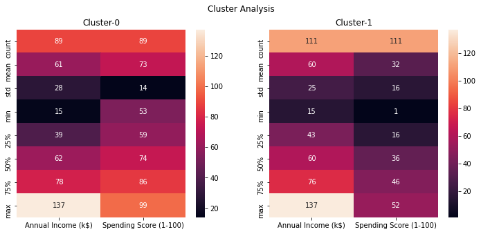
Based on the above scatterplot & heatmap ,
- Cluster-0 are customers with spending score greater than 50 (approx)
- Cluster-1 are customers with spending score less than 50 m(approx)
No distinctions of customers in terms of Annual income , so basically these clusters are not super useful , so try to find optimal clusters using elbow method
%%time
SSE = []
for i in range(1, 11):
    kmeans = KMeans(n_clusters = i, random_state = 7)
    kmeans.fit(arr1)
    SSE.append(kmeans.inertia_)
Wall time: 1.7 s
plt.figure(figsize=(12,5))
sns.lineplot(range(1, 11), SSE,marker='o')
plt.title('Elbow Method')
plt.xlabel('Number of clusters')
plt.ylabel('SSE')
plt.show()
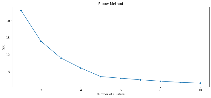
K-means Algorithm (Number of Clusters = 5)
Starting with K-means algorithm with 5 clusters based on the optimal number of clusters from Elbow method
- Parameters
- n_clusters : Number of clusters
- random_state : for reproducibility
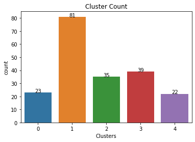
kmeans_cluster=KMeans(n_clusters=5,random_state=7)
result_cluster=kmeans_cluster.fit_predict(arr1)
df1['Clusters']=result_cluster
df1['Clusters'].value_counts()
1    81
3    39
2    35
0    23
4    22
Name: Clusters, dtype: int64
d1=df[['Gender','Age_bins']].reset_index(drop=True)
d1.head()
| Gender | Age_bins | |
|---|---|---|
| 0 | Male | 18-35 |
| 1 | Male | 18-35 |
| 2 | Female | 18-35 |
| 3 | Female | 18-35 |
| 4 | Female | 18-35 |
df1_comb=pd.concat([df1.reset_index(drop=True),d1],axis=1)
df1_comb.head()
| Annual Income (k$) | Spending Score (1-100) | Clusters | Gender | Age_bins | |
|---|---|---|---|---|---|
| 0 | 15 | 39 | 0 | Male | 18-35 |
| 1 | 15 | 81 | 4 | Male | 18-35 |
| 2 | 16 | 6 | 0 | Female | 18-35 |
| 3 | 16 | 77 | 4 | Female | 18-35 |
| 4 | 17 | 40 | 0 | Female | 18-35 |
ax=sns.countplot(x=df1_comb.Clusters)
for index, row in pd.DataFrame(df1_comb['Clusters'].value_counts()).iterrows():
    ax.text(index,row.values[0], str(round(row.values[0])),color='black', ha="center")
    #print(index,row.values[0])
plt.title('Cluster Count')
plt.show()
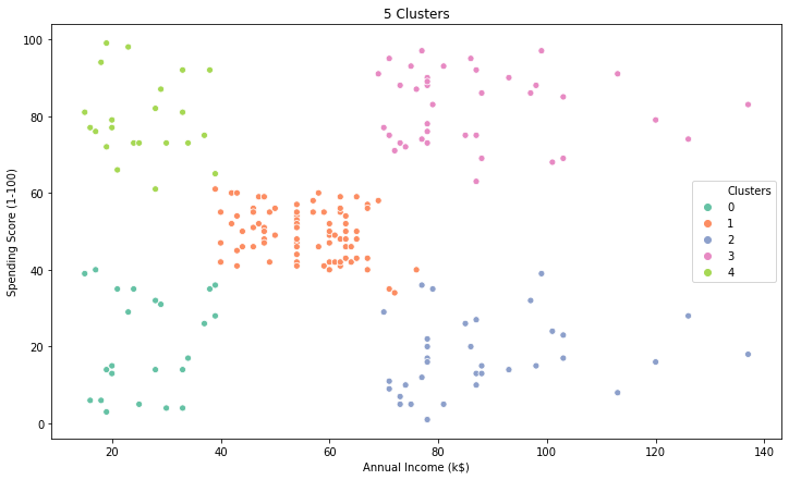
plt.figure(figsize=(12,7))
sns.scatterplot(x=df1_comb['Annual Income (k$)'],y=df1_comb['Spending Score (1-100)'],hue=df1_comb.Clusters,palette="Set2",)
plt.title('5 Clusters')
plt.show()
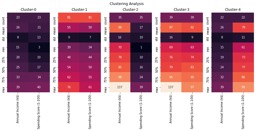
fig,ax=plt.subplots(1,5,figsize=(15,5))
#cbar_ax = fig.add_axes([1.03, .3, .03, .4])
for cluster_val in sorted(df1_comb.Clusters.unique()):
    #print(cluster_val)
    sns.heatmap(df1_comb.loc[df1_comb.Clusters==cluster_val,['Annual Income (k$)', 'Spending Score (1-100)']].describe().round(),annot=True,fmt='g',ax=ax[cluster_val],\
               cbar=i == 0,vmin=0, vmax=130)
    titl='Cluster-'+str(cluster_val)
    ax[cluster_val].set_title(titl)

plt.suptitle('Clustering Analysis')

#plt.tight_layout()
plt.show()
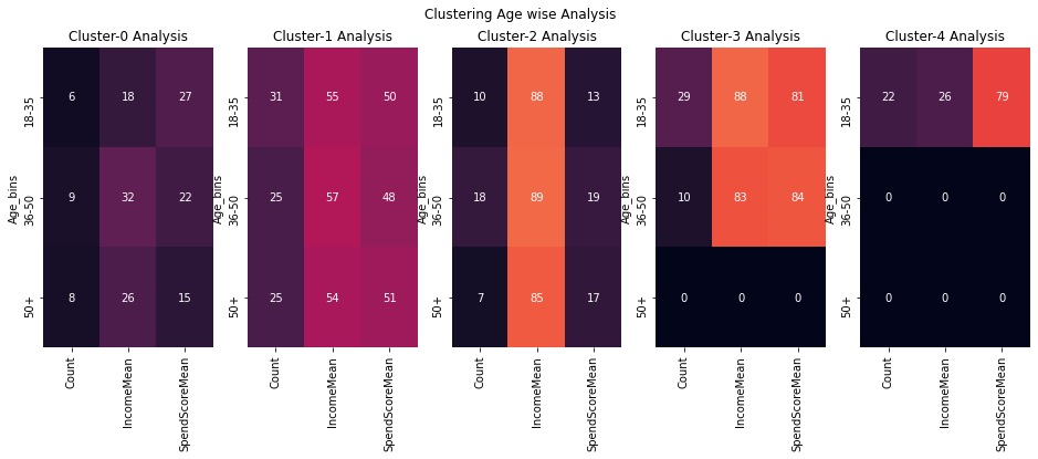
fig,ax=plt.subplots(1,5,figsize=(16,5))
#cbar_ax = fig.add_axes([1.03, .3, .03, .4])
for cluster_val in sorted(df1_comb.Clusters.unique()):
    #print(cluster_val)
    sns.heatmap(df1_comb.loc[df1_comb.Clusters==cluster_val,:].groupby('Age_bins').agg({'Clusters':'size','Annual Income (k$)':'mean','Spending Score (1-100)':'mean'}).\
    rename(columns={'Clusters':'Count','Annual Income (k$)':'IncomeMean','Spending Score (1-100)':'SpendScoreMean'})\
                .fillna(0).round(),annot=True,fmt='g',ax=ax[cluster_val],cbar=i == 0,vmin=0, vmax=130)
    titl='Cluster-'+str(cluster_val)+' Analysis'
    ax[cluster_val].set_title(titl)


plt.suptitle('Clustering Age wise Analysis')

#plt.tight_layout()
plt.show()
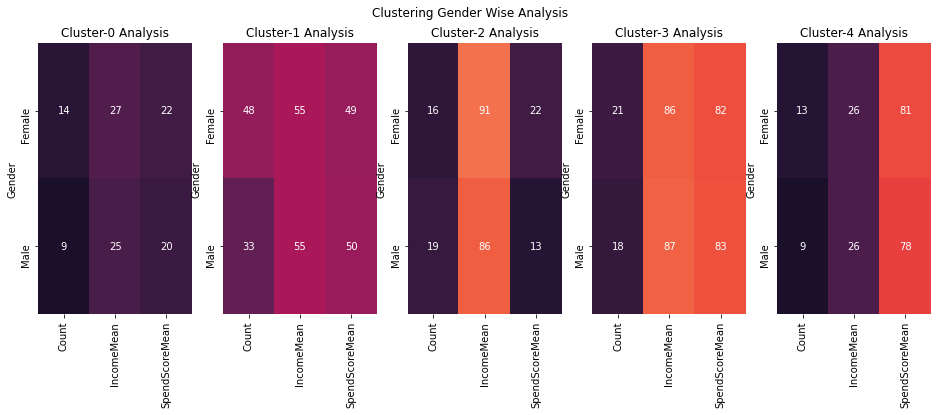
fig,ax=plt.subplots(1,5,figsize=(16,5))
#cbar_ax = fig.add_axes([1.03, .3, .03, .4])
for cluster_val in sorted(df1_comb.Clusters.unique()):
    #print(cluster_val)
    sns.heatmap(df1_comb.loc[df1_comb.Clusters==cluster_val,:].groupby('Gender').agg({'Clusters':'size','Annual Income (k$)':'mean','Spending Score (1-100)':'mean'}).\
    rename(columns={'Clusters':'Count','Annual Income (k$)':'IncomeMean','Spending Score (1-100)':'SpendScoreMean'})\
                .fillna(0).round(),annot=True,fmt='g',ax=ax[cluster_val],cbar=i == 0,vmin=0, vmax=130)
    titl='Cluster-'+str(cluster_val)+' Analysis'
    ax[cluster_val].set_title(titl)


plt.suptitle('Clustering Gender Wise Analysis')

#plt.tight_layout()
plt.show()
plt.figure(figsize=(12,5))

sns.boxplot(x='Clusters',y='value',hue='variable',\
            data=pd.melt(df1,id_vars=['Clusters'],value_vars=['Annual Income (k$)','Spending Score (1-100)']),\
           palette="Set2")
plt.xlabel("Clusters")
plt.title("Boxplot-Annual Income - Spending Score")
plt.show()
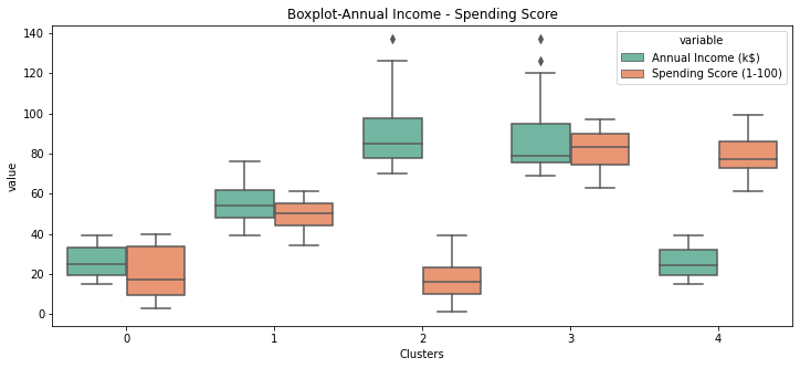
Observations
| Cluster | Income | Spending Score |
|---|---|---|
| 0 | Low | Low |
| 1 | Medium | Medium |
| 2 | High | Low |
| 3 | High | High |
| 4 | Low | High |
Interesting Insight
- Cluster-2 are high income customers but they are low spenders
- Cluster-4 are low income customers but they are high spenders ( only Age Group 18-35 so mostly youngsters)
- Cluster-1 have the most number of customers , these are middle class people with medium spending & income.
All age-groups & gender are kind of evenly distributed among these clusters ,so these clusters are not super useful if we want to target specific gender or age-group for our marketing campaigns , so lets try to bring in these demographics data and use it to build out clusters but since these demographics data (Age group / Gender) are categorical values K-means would not work because it uses euclidean distance as metric to calculate distance so we will be using K-Prototypes which takes care of mixed data types , it applies euclidean distance for numerical data and hamming distance for categorical data.
K-Prototypes
k-modes is used for clustering categorical variables. It defines clusters based on the number of matching categories between data points. (This is in contrast to the more well-known k-means algorithm, which clusters numerical data based on Euclidean distance.) The k-prototypes algorithm combines k-modes and k-means and is able to cluster mixed numerical / categorical data.
For more info, Please refer Github
df_proto=pd.DataFrame(arr1,columns=['AnnualIcome','SpendingScore'])
df_proto.head()
| AnnualIcome | SpendingScore | |
|---|---|---|
| 0 | 0.000000 | 0.387755 |
| 1 | 0.000000 | 0.816327 |
| 2 | 0.008197 | 0.051020 |
| 3 | 0.008197 | 0.775510 |
| 4 | 0.016393 | 0.397959 |
d2=pd.concat([df_proto,d1],axis=1)
d2.head()
| AnnualIcome | SpendingScore | Gender | Age_bins | |
|---|---|---|---|---|
| 0 | 0.000000 | 0.387755 | Male | 18-35 |
| 1 | 0.000000 | 0.816327 | Male | 18-35 |
| 2 | 0.008197 | 0.051020 | Female | 18-35 |
| 3 | 0.008197 | 0.775510 | Female | 18-35 |
| 4 | 0.016393 | 0.397959 | Female | 18-35 |
K-Prototypes Algorithm (Number of Clusters = 5)
Starting with K-Prototypes algorithm with 5 clusters
- Parameters
- n_clusters : Number of clusters
- random_state : for reproducibility
Points to consider for K-Prototypes
- In fit_predict method , “categorical” parameter takes in the value of index of the categorical features.
| ColumnIndex | Feature | DataType |
|---|---|---|
| 0 | AnnualIcome | float64 |
| 1 | SpendingScore | float64 |
| 2 | Gender | object |
| 3 | Age_bins | object |
To standardize the numerical data use MinMaxScaler instead of StandardScaler
-
MinMaxScaler will bring the numerical features within range of [0,1], so because of this , distance calculated based on the euclidean distance for numerical features will be comparable to that of hamming distance for categorical data.
-
If StandardScaler is used to standardize the numerical data , numerical features will no longer in the range of [0,1] and will drive the analysis and clusters will be biased towards numerical features and in this example resultant cluster will be exactly same as K-means clusters. I would encourage to run the same analysis with StandardScaler to understand this idea better.
%%time
kproto_clusters=KPrototypes(n_clusters=5,random_state=7,init="Cao")
result_cluster=kproto_clusters.fit_predict(d2,categorical=[2,3])
Wall time: 2.5 s
d2['Clusters']=result_cluster
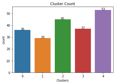
d2['Clusters'].value_counts()
4    53
2    45
3    37
0    36
1    29
Name: Clusters, dtype: int64
ax=sns.countplot(x=d2.Clusters)
for index, row in pd.DataFrame(d2['Clusters'].value_counts()).iterrows():
    ax.text(index,row.values[0], str(round(row.values[0])),color='black', ha="center")
    #print(index,row.values[0])
plt.title('Cluster Count')
plt.show()
Clusters Centroid
kproto_clusters.cluster_centroids_
[array([[0.26662113, 0.34807256],
        [0.48473714, 0.2244898 ],
        [0.3712204 , 0.69931973],
        [0.40097475, 0.34362934],
        [0.36776987, 0.70157874]]),
 array([['Female', '50+'],
        ['Male', '36-50'],
        ['Male', '18-35'],
        ['Female', '36-50'],
        ['Female', '18-35']], dtype='<U6')]
df1.drop(['Clusters'],axis=1,inplace=True)
d3=pd.concat([df1.reset_index(drop=True),d2],axis=1)
d3.head()
| Annual Income (k$) | Spending Score (1-100) | AnnualIcome | SpendingScore | Gender | Age_bins | Clusters | |
|---|---|---|---|---|---|---|---|
| 0 | 15 | 39 | 0.000000 | 0.387755 | Male | 18-35 | 2 |
| 1 | 15 | 81 | 0.000000 | 0.816327 | Male | 18-35 | 2 |
| 2 | 16 | 6 | 0.008197 | 0.051020 | Female | 18-35 | 0 |
| 3 | 16 | 77 | 0.008197 | 0.775510 | Female | 18-35 | 4 |
| 4 | 17 | 40 | 0.016393 | 0.397959 | Female | 18-35 | 0 |
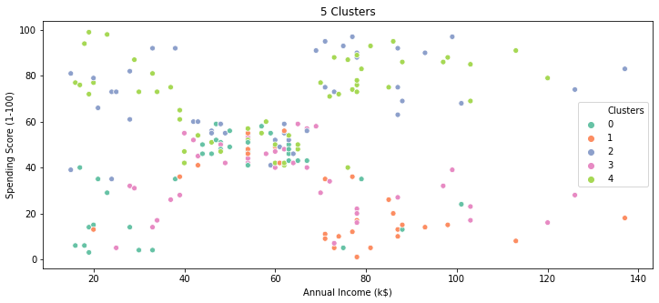
plt.figure(figsize=(12,5))
sns.scatterplot(x=d3['Annual Income (k$)'],y=d3['Spending Score (1-100)'],hue=d3.Clusters,palette="Set2",)
plt.title('5 Clusters')
plt.show()
plt.figure(figsize=(12,5))
sns.scatterplot(x=d3['Annual Income (k$)'],y=d3['Spending Score (1-100)'],hue=d3.Age_bins,palette="Set2",)
plt.title('5 Clusters')
plt.show()
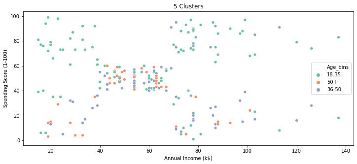
Based on the above scatter plot , it seems there is no clear pattern ,but important point here to understand is that we have used 4 features to build out these clusters and we have plotted just 2 features here so appearance could be deceptive ,keep an open mind.
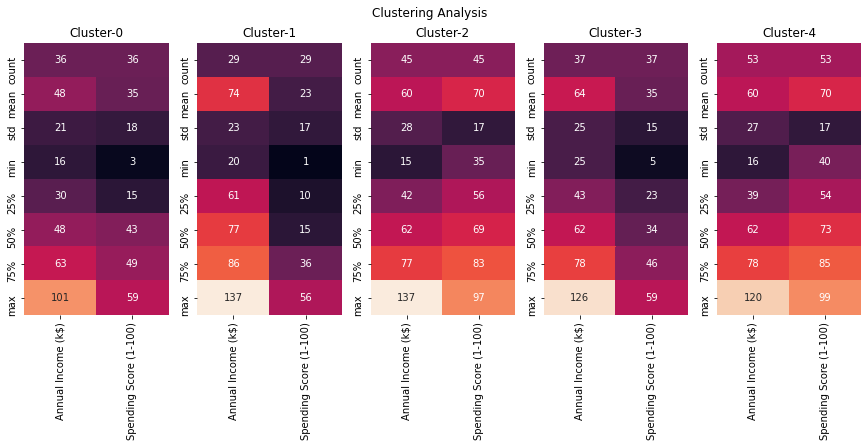
fig,ax=plt.subplots(1,5,figsize=(15,5))
#cbar_ax = fig.add_axes([1.03, .3, .03, .4])
for cluster_val in sorted(d3.Clusters.unique()):
    #print(cluster_val)
    sns.heatmap(d3.loc[d3.Clusters==cluster_val,['Annual Income (k$)', 'Spending Score (1-100)']].describe().round(),annot=True,fmt='g',ax=ax[cluster_val],\
               cbar=i == 0,vmin=0, vmax=130)
    titl='Cluster-'+str(cluster_val)
    ax[cluster_val].set_title(titl)


plt.suptitle('Clustering Analysis')

#plt.tight_layout()
plt.show()
fig,ax=plt.subplots(1,5,figsize=(16,5))
#cbar_ax = fig.add_axes([1.03, .3, .03, .4])
for cluster_val in sorted(d3.Clusters.unique()):
    #print(cluster_val)
    sns.heatmap(d3.loc[d3.Clusters==cluster_val,:].groupby('Age_bins').agg({'Clusters':'size','Annual Income (k$)':'mean','Spending Score (1-100)':'mean'}).\
    rename(columns={'Clusters':'Count','Annual Income (k$)':'IncomeMean','Spending Score (1-100)':'SpendScoreMean'})\
                .fillna(0).round(),annot=True,fmt='g',ax=ax[cluster_val],cbar=i == 0,vmin=0, vmax=130)
    titl='Cluster-'+str(cluster_val)+' Analysis'
    ax[cluster_val].set_title(titl)


plt.suptitle('Clustering Age wise Analysis')

#plt.tight_layout()
plt.show()
fig,ax=plt.subplots(1,5,figsize=(16,5))
#cbar_ax = fig.add_axes([1.03, .3, .03, .4])
for cluster_val in sorted(d3.Clusters.unique()):
    #print(cluster_val)
    sns.heatmap(d3.loc[d3.Clusters==cluster_val,:].groupby('Gender').agg({'Clusters':'size','Annual Income (k$)':'mean','Spending Score (1-100)':'mean'}).\
    rename(columns={'Clusters':'Count','Annual Income (k$)':'IncomeMean','Spending Score (1-100)':'SpendScoreMean'})\
                .fillna(0).round(),annot=True,fmt='g',ax=ax[cluster_val],cbar=i == 0,vmin=0, vmax=130)
    titl='Cluster-'+str(cluster_val)+' Analysis'
    ax[cluster_val].set_title(titl)


plt.suptitle('Clustering Gender Wise Analysis')

#plt.tight_layout()
plt.show()
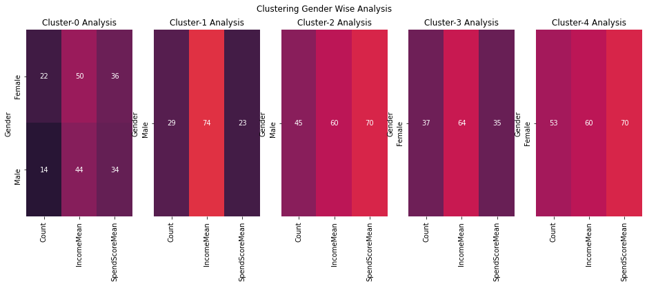
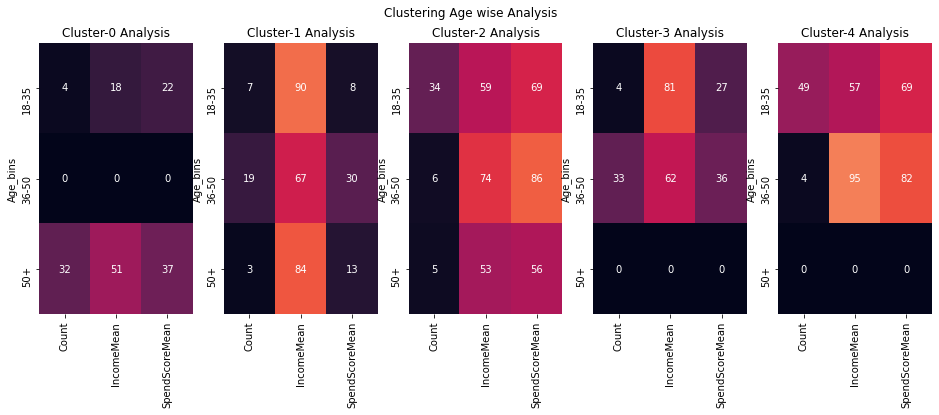
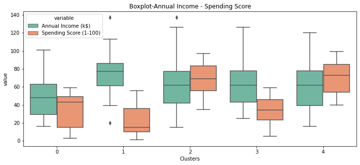
Observations
| Cluster | Age-Group | Gender | Income | Spending Score |
|---|---|---|---|---|
| 0 | 50+ | Females | Medium | Low |
| 1 | 36-50 | Males | High | Low |
| 2 | 18-35 | Males | Medium | High |
| 3 | 36-50 | Females | Medium | Low |
| 4 | 18-35 | Females | Medium | High |
Interesting Insight
- Cluster 4 & Cluster 2 are youngsters who are high on spending.
- Cluster 1 & Cluster 3 are middle age adults who are low on spending.
- Cluster 0 are old age females who are low on spending.
Based on these insights we can map out a marketing strategy to target each cluster and increase the profits.
plt.figure(figsize=(12,5))

sns.boxplot(x='Clusters',y='value',hue='variable',\
            data=pd.melt(d3,id_vars=['Clusters'],value_vars=['Annual Income (k$)','Spending Score (1-100)']),\
           palette="Set2")
plt.xlabel("Clusters")
plt.title("Boxplot-Annual Income - Spending Score")
plt.show()

Leave a comment